XP Investimentos · 2021–2022
Order Entry
3 min → 30 s
and 80%+ of active brokers
Order entry rebuilt around the keyboard, for brokers on the desk
The problem
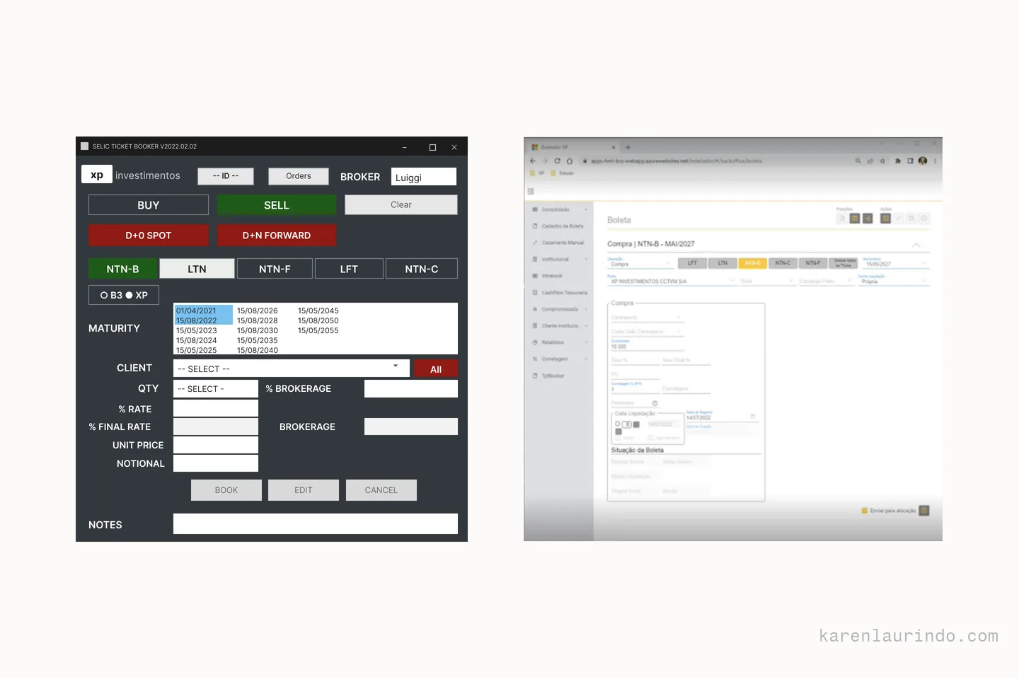
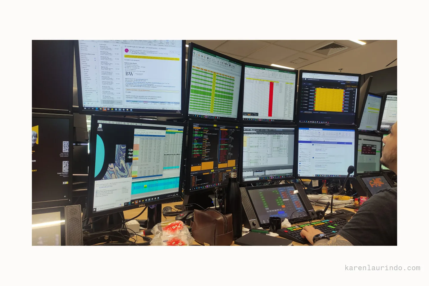
I was the only designer on this product. The users were XP's own brokers on the desk: not advisors in the field, but people sitting with several windows open, entering orders in volume all day. Two tools were in play. The one brokers actually used was an old desktop utility everyone called the boletadorzinho: limited, running on an external server nobody wanted to maintain, and fast. The one the company wanted them on was the internal web system, which had low adoption. A single order took three minutes there. The time came from three places: the number of fields, hunting for information somewhere else, and waiting on the system. The root cause was not the interface. The previous version came from an external vendor and could not reach XP's internal data, so brokers typed in by hand information the company already had. No redesign of that system would have fixed it. It was a question of who owned the data. This came from seven interviews with brokers and two days of shadowing, one full day with each of two brokers, running a real order entry alongside them. The shadowing is what produced the finding the interviews had missed: brokers moved through the ticket with Tab and the arrow keys, never touching the mouse, and any layout that broke that order broke their speed.
What I ruled out
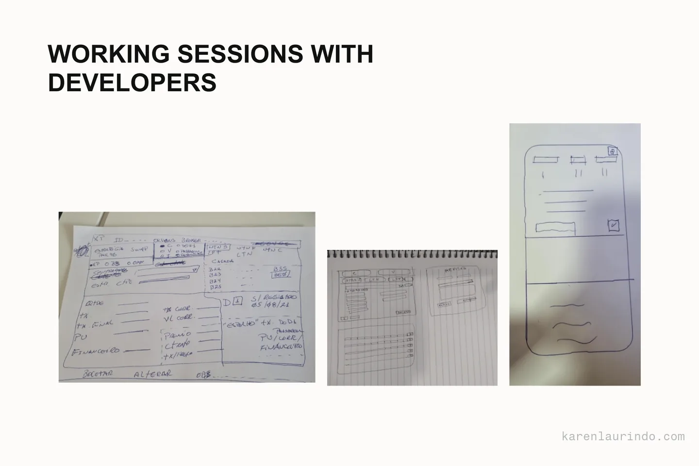
Several information layouts were tested before the final one. A single larger screen was discarded: brokers needed that screen space for other things, and an order ticket has no business taking over the monitor of someone working across many windows. Step by step was discarded too. The hardest one to drop was the layout that mirrored the order of the old system. It was familiar, but it was bad for them and it produced wrong entries. Keeping the muscle memory would have preserved the error along with it. Breaking with the familiar forces relearning, and that is an uncomfortable call to defend, but the familiar was the source of the mistake.
The decision
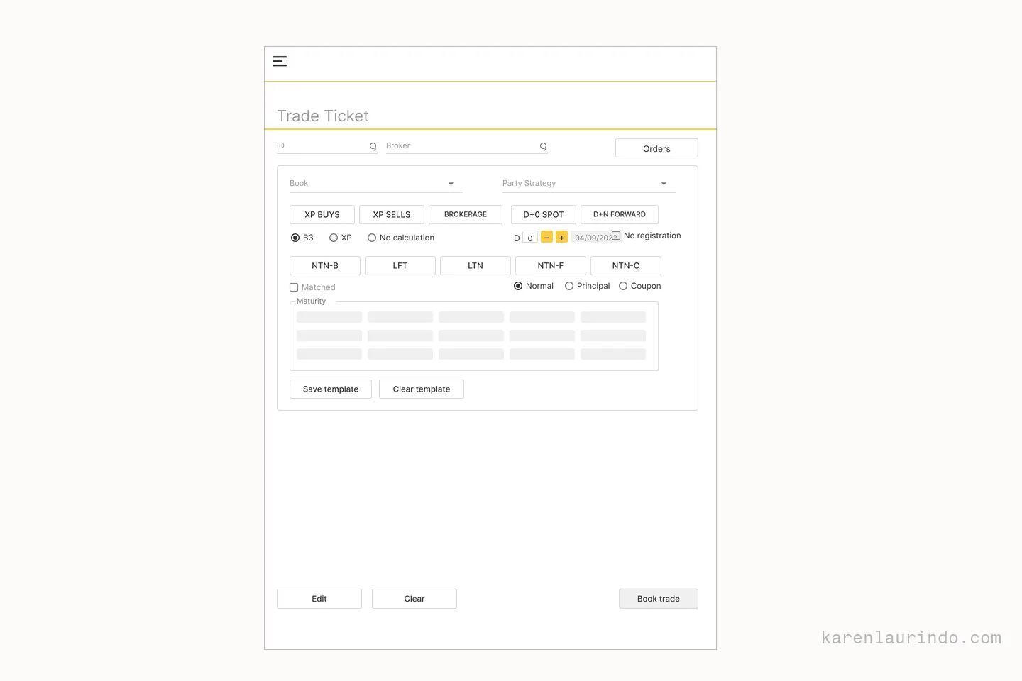
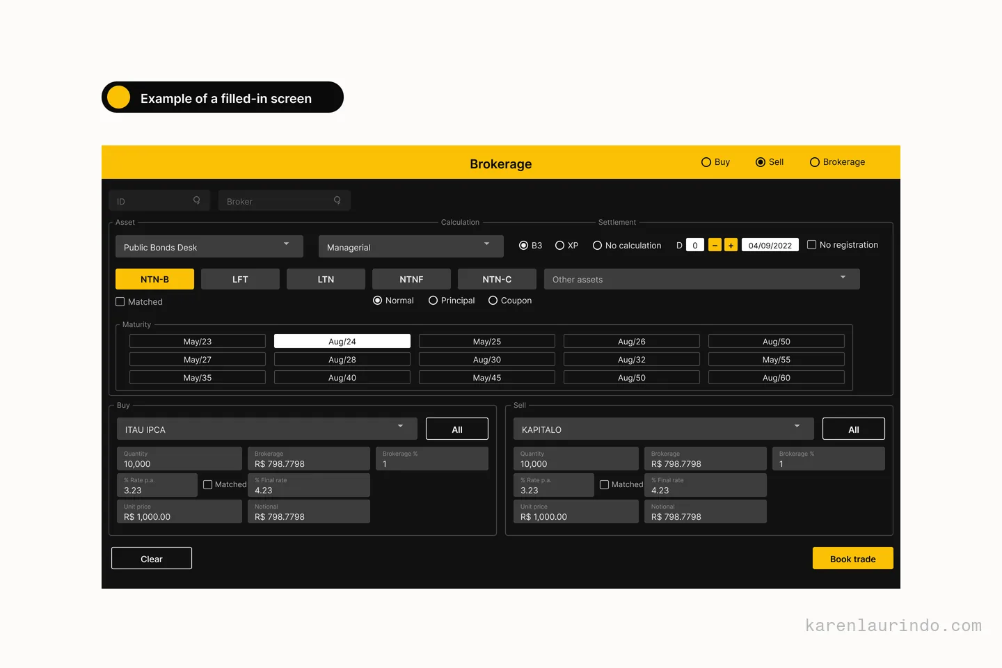
Boundary of authorship first: the decision to internalize the systems had already been made by the company. Everything was being brought in house, and the redesign travelled with it. My contribution was what to do with the opening, not the choice to open it. What I did with it: navigation driven by Tab, because a desk professional does not take their hands off the keyboard, and a set of fields fed directly from XP's own internal data, precisely what the external vendor could not do. Same question I had asked in the field at Itaú, where are the user's hands, with the opposite answer: voice out there, keyboard here. What went into each release was decided in two passes: first with the two brokers who had followed the project from the start, ranking what they could not work without, then with the product manager and the tech lead, weighing business priority against what could actually be built. The feature ideas themselves came out of a Crazy 8s session I ran with the engineers, which had a second effect I did not plan for: the people who would build it had argued for it first.
The result
Order entry went from three minutes to thirty seconds, and the platform reached more than 80% of active brokers. Both were measured after release, not projected: thirty seconds was the speed of the old desktop tool, so it was the bar the new platform had to clear rather than a number picked for the slide. The gain is not one clever screen; it is the removal of the lookups that the old vendor system forced, plus a field order that no longer invited the wrong entry, plus a form the broker can move through with Tab instead of reaching for the mouse.
What I'd do differently
Two things. A dark mode version from the start, rather than as something to be added later. And fewer fields still: fill in only what is indispensable, land on a confirmation screen, and offer an edit for whatever is wrong there. That inverts the logic of the form: instead of filling everything in and then checking it, you fill in the minimum and correct the exception.