IBBA360 DESIGN SYSTEM
The challenge consisted of integrating the IDS (Itaú Design System) with the design system available on the Salesforce platform.
This required creating an easy-to-use component consumption system, made available through Figma, as well as ensuring interface quality and validating its correct implementation in production.
Identification of Salesforce and IDS Components
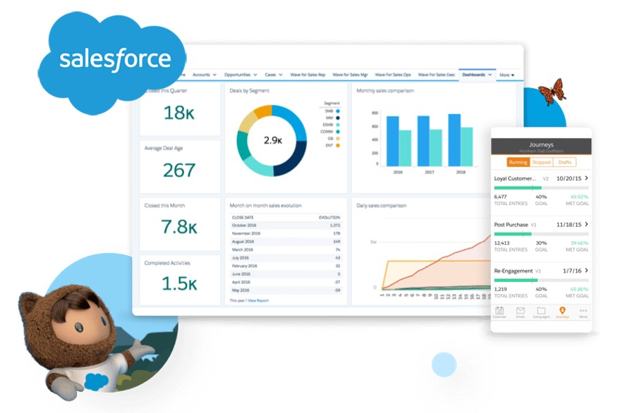
The development of the IBBA 360 Design System (DS) began with a detailed assessment of Salesforce components and their adaptation to the visual and style standards of the Itaú Design System (IDS). The goal was to ensure a consistent identity aligned with the brand without compromising functionality and scalability within the Salesforce ecosystem.
Process Steps
Component Assessment
A comprehensive analysis of standard Salesforce components was carried out, identifying their features and limitations. In parallel, the IDS components were analyzed, mapping their visual, interactive, and accessibility characteristics.
Mapping Between Design Systems
Each Salesforce component was compared to its equivalent in the IDS, looking for structural and stylistic similarities. For components without a direct match, visual and functional adaptations aligned with Itaú's design guidelines were proposed.
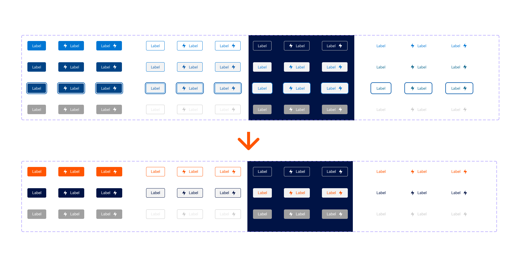
Visual and Functional Adaptation
Salesforce components were adjusted to incorporate IDS elements, such as color palette, typography, spacing, and visual hierarchy, ensuring a consistent and coherent experience.
Documentation and Standardization
All adapted or newly created components were documented in a centralized library, including usage examples, variations, and technical specifications to facilitate use by design and development teams.
Building Complex Components
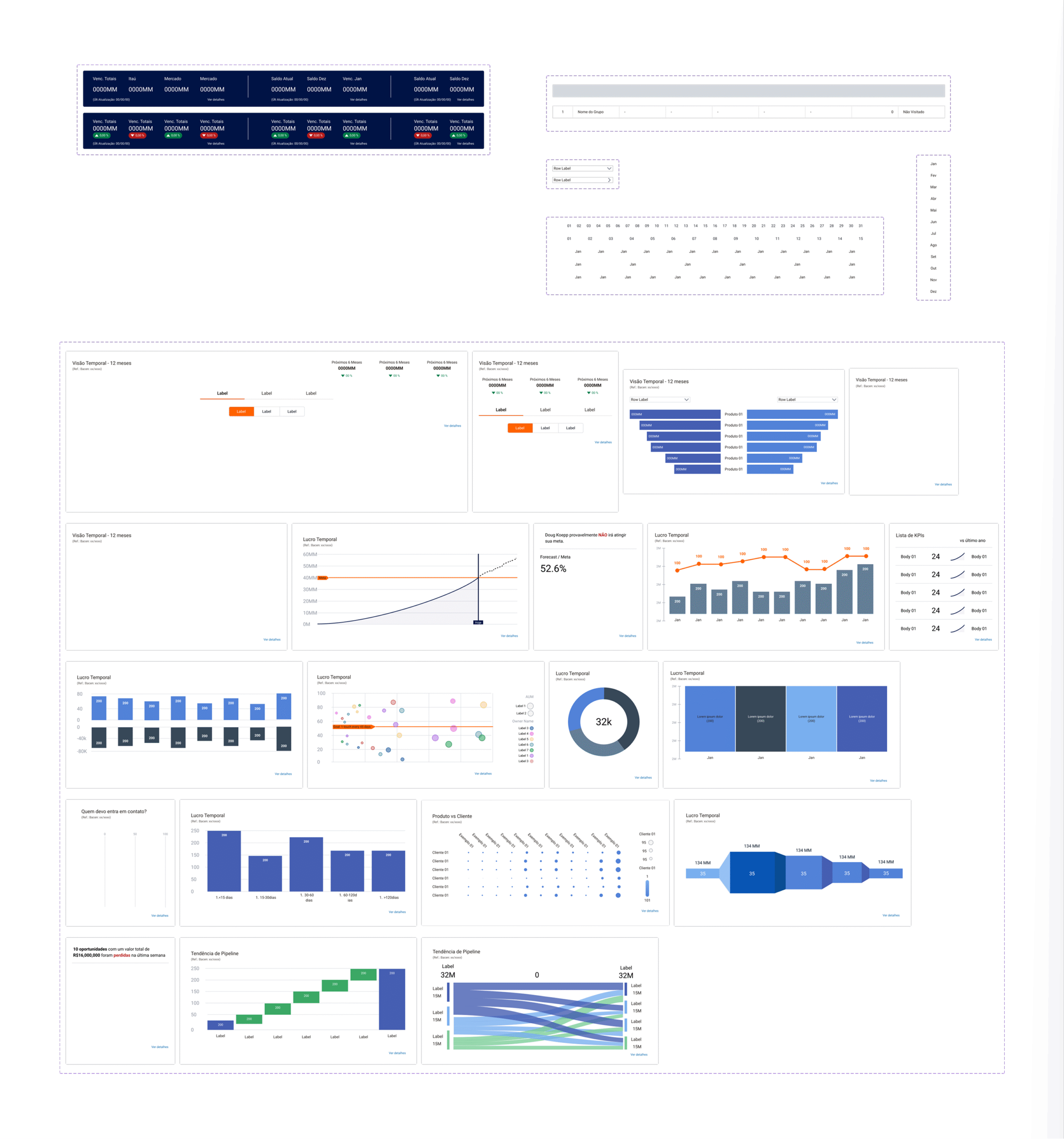
In the development of the IBBA 360 Design System, complex components were created, such as:
- Tables
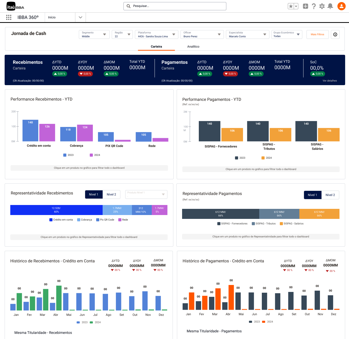
- Charts
- Filter Bar
- Header with Big Number
Features in Figma
In Figma, features were implemented to toggle component variations on and off, allowing designers to quickly adjust the settings of each element. This functionality optimized the design process, making it more agile and efficient when creating custom layouts and working under different page contexts.
Main Objective
Develop reusable components and standardized pages, enabling faster creation and implementation of new interfaces while maintaining consistency and scalability.
Technical Implementation
The components were developed within the Salesforce environment using LWC (Lightning Web Components), which brought the following benefits:
- Scalability: Components optimized for multiple use cases.
- Process Agility: Reduction in delivery time for new screens and flows.
- Visual and Functional Consistency: Alignment with Design System standards and the Itaú brand identity.
Special Tokens: Colors and Charts
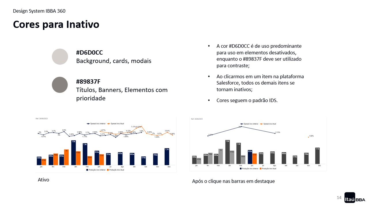
The Design System colors were developed based on the bank's official palette, but adapted to meet accessibility criteria. The objective was to guarantee that colors were functional, aligned with the brand's visual identity, and accessible to all users.
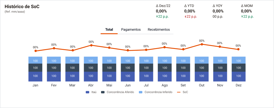
Colors for Charts
Since the IDS (Itaú Design System) did not have a specific palette for charts, it was necessary to create a custom palette following the principles of visibility and contrast.
The new palette was developed with combinations that prioritize readability and visual differentiation, covering as many variations as possible.
Accessibility tests were performed to ensure that color combinations would not hinder reading and were suitable for users with visual impairments, such as color blindness.
Tools Used
- Adobe Color: Palette creation and organization.
- Stark: Color contrast testing, ensuring compliance with accessibility guidelines (WCAG).
- Color Blind: Identification and correction of issues related to color blindness, adjusting combinations as needed.

Color Interactions and Text Readability
Interactions between colors and their combinations with typography overlays were thoroughly tested to guarantee text readability across different usage contexts, such as colored backgrounds, charts, and highlighted areas of the interface.
These tests aimed to ensure that the contrast between text and background maintained a comfortable and accessible reading experience, regardless of lighting levels, information density, or the user's visual conditions.
Results
- Functional and Inclusive Palette: A color palette aligned with the bank's visual identity and accessible to users with different visual needs, ensuring proper contrast and readability in all usage contexts.
- Optimized Charts: Clear and efficient visualizations capable of communicating data accurately and with easy interpretation, regardless of the application context or potential visual limitations of users.
These results consolidated a solid visual foundation for IBBA 360, balancing aesthetics, accessibility, and functionality, and strengthening the consistency of the digital experience within the Itaú ecosystem.
Following the development of the IBBA 360 Design System (DS), it became essential to create dissemination and guidance strategies to ensure that teams correctly adopted the established components and standards.
Promotion Strategies
Centralized Library
The libraries were made available on specific platforms for each audience:
- Figma, tailored for design teams.
- Salesforce, directed toward developers.
The structure was organized in a clear and intuitive way, with well-defined categories that facilitate locating and reusing components, promoting standardization and efficiency in the creation process.
Comprehensive Documentation
A detailed usage guide was developed, containing:
- Description of components and their variations.
- Practical application examples in different contexts.
- Best practices to ensure consistency, accessibility, and visual alignment with the Itaú Design System.
The documentation was hosted on SharePoint for all designers, ensuring availability and quick reference.
Continuous Support
A dedicated support channel was created to answer questions and receive feedback regarding the use of the libraries and the guide.
Regular updates were implemented based on the needs and suggestions of the teams, ensuring the constant evolution of the Design System and strengthening the shared design culture within the organization.