UXQA Method
The UXQA Method was created to ensure quality and consistency between design and development, with a focus on the Salesforce environment.
Steps
- Research and Metric Definition: Identification of criteria such as visual consistency, usability, accessibility, and efficiency.
- UXQA Spreadsheet Creation: An automated Excel tool to measure and visualize quality with dynamic calculations and charts.
- Application and Validation: Testing with the development team to compare prototypes and implemented screens, with structured feedback.
Versions
- V1 Full: Detailed and ideal for complex projects.
- V2 Simplified: Adapted for Salesforce, prioritizing agility.
- Management Spreadsheet: Monitors quality percentages and generates automatic charts.
Results
- Significant improvement in quality and fidelity to prototypes.
- Broader adoption by other teams.
- Smoother integration between design and development.
- Reduced rework and efficient quality monitoring.
During my work as a Product Designer, I identified the need to develop a UXQA (User Experience Quality Assurance) method to ensure that implementations in development maintained the quality and fidelity of the created prototypes.
The main challenge was ensuring that the designed experience was consistently translated into the final product, especially within the Salesforce ecosystem, known for its technical complexity and high level of customization.
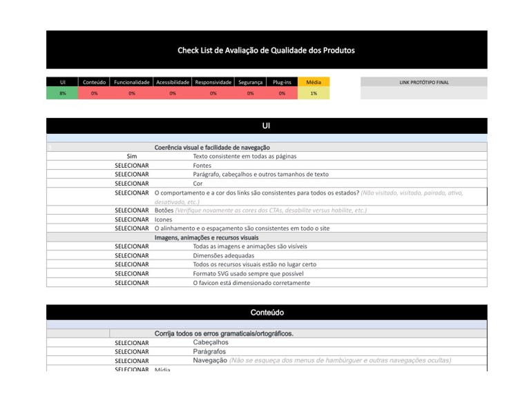
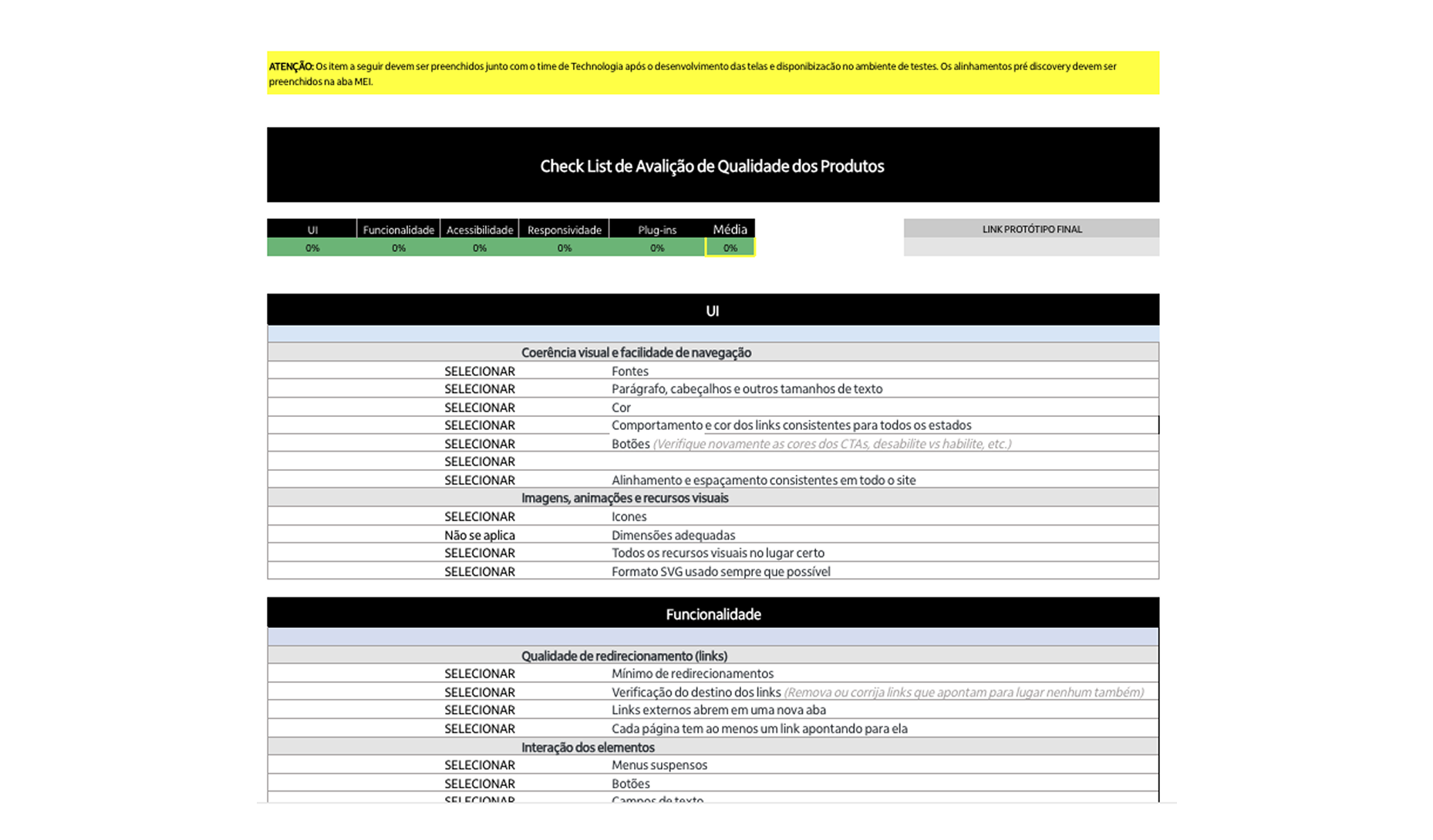
To ensure a high level of quality and a quantitative way to compare products, I created an evaluation table that measures the acceptance rate of deliveries based on the main UX quality heuristics. This model enabled:
- Objective quality monitoring: Evaluation of interface elements, usability, and consistency based on clear metrics.
- Deviation identification: Facilitating the detection of differences between prototypes and implementations during the development stage.
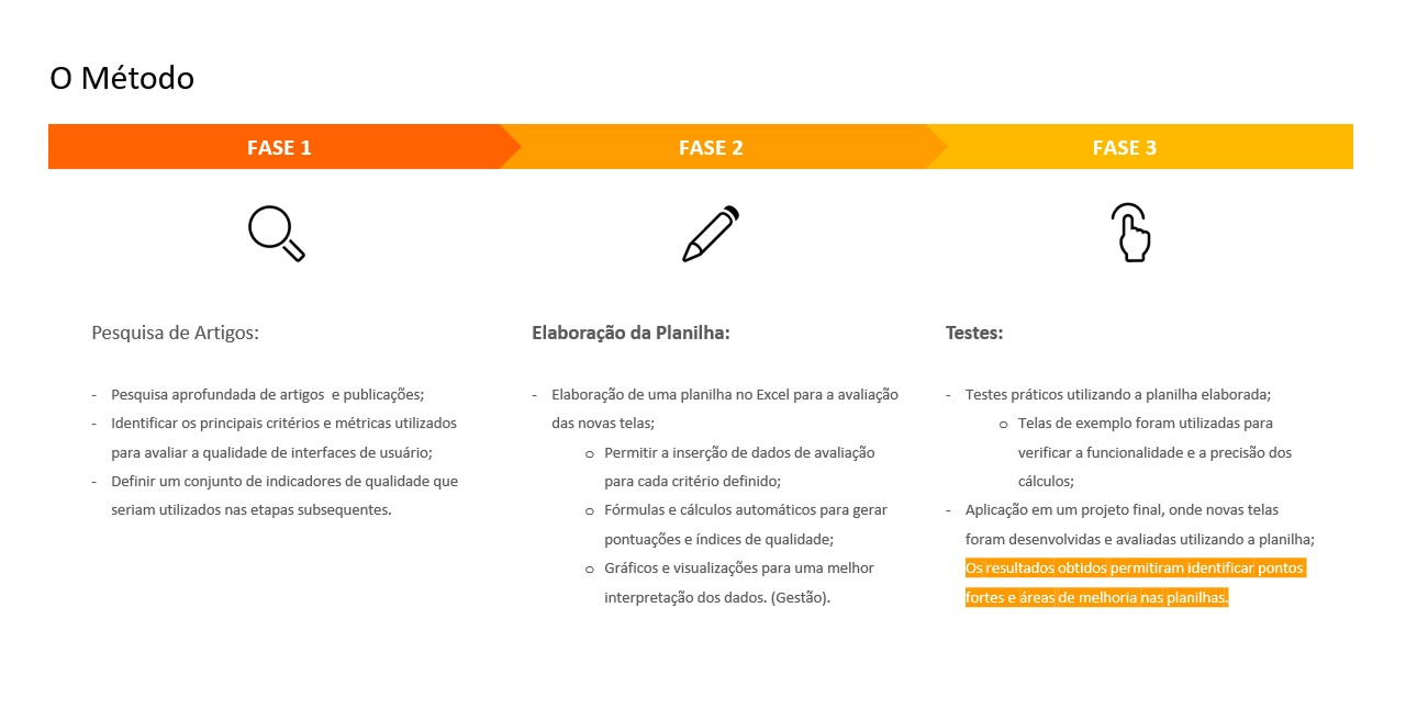
The first phase of developing the UXQA Method focused on research and structuring UX and UI quality metrics and criteria. The main goal was to establish a solid foundation for evaluating delivery quality throughout the following stages.
Phase 1
- Research of Articles and References: I conducted a detailed analysis of academic articles, case studies, and market best practices, focusing on quality methodologies applied to digital product design. This research was essential to understand challenges and identify reliable benchmarks.
- Mapping Quality Metrics and Criteria: Based on the research, I organized and categorized relevant UX and UI metrics. Key criteria mapped include:
• Visual Consistency: Fidelity to the design system.
• Usability: Evaluation based on classic heuristics, such as Nielsen’s.
• Accessibility: Compliance with WCAG guidelines.
• Efficiency: Response time and navigation fluidity.
- Defining a Set of Indicators: From the identified metrics, I defined a set of key indicators to measure quality at each stage of development. These indicators served as the basis for quantitative and qualitative evaluations, ensuring greater objectivity in the process.
Phase 2
In the second phase of the UXQA Method, the focus was developing a practical tool to facilitate evaluation and ensure efficiency in applying the defined quality metrics.
Phase 2 Steps:
- Excel Spreadsheet Creation: I developed a structured spreadsheet to organize all metrics, quality criteria, and indicators defined in the previous phase. This spreadsheet worked as a centralized repository for data collection and analysis, enabling a clear and systematic evaluation process.
- Calculation Automation:
To ensure efficiency and eliminate manual errors, I automated calculation processes in the spreadsheet. This included:
• Dynamic Scoring: Formulas to automatically calculate acceptance percentages based on each metric’s results.
• Weighted Metrics: Integration of specific weights for certain criteria, reflecting their importance in the final evaluation.
• Real-Time Results: Automatic generation of consolidated scores and visual indicators to provide an immediate view of the quality level.
Phase 3
In the third phase of the UXQA Method, the focus shifted to practical application through testing and validation of implemented screens.
Phase 3 Steps:
- Testing with the Development Team: Collaboration with the development team was fundamental in this phase to ensure alignment of expectations and deliverables. Implemented screens were tested using previously defined metrics and criteria to identify deviations from prototypes. Tools such as Figma and the Salesforce development environment were used for side-by-side comparisons, ensuring fidelity to the design.
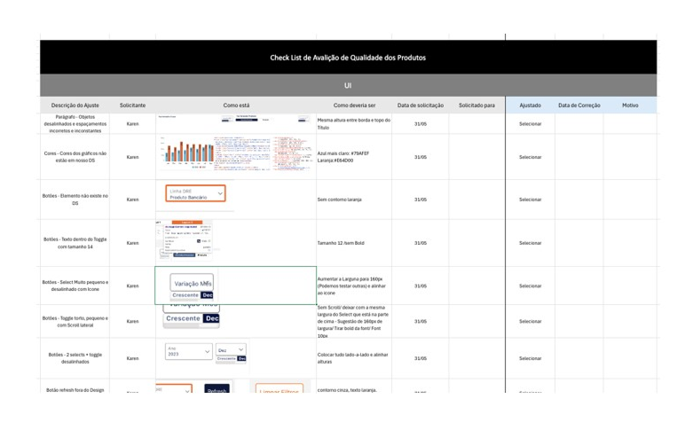
- Acceptance of the Implemented Screen: Screens that met the pre-established acceptance criteria were marked as approved. For those needing adjustments, the development team received feedback with clear, actionable points for improvement. Metrics from the automated spreadsheet (created in Phase 2) provided objective insights into the acceptance rate, ensuring transparency in the decision-making process.
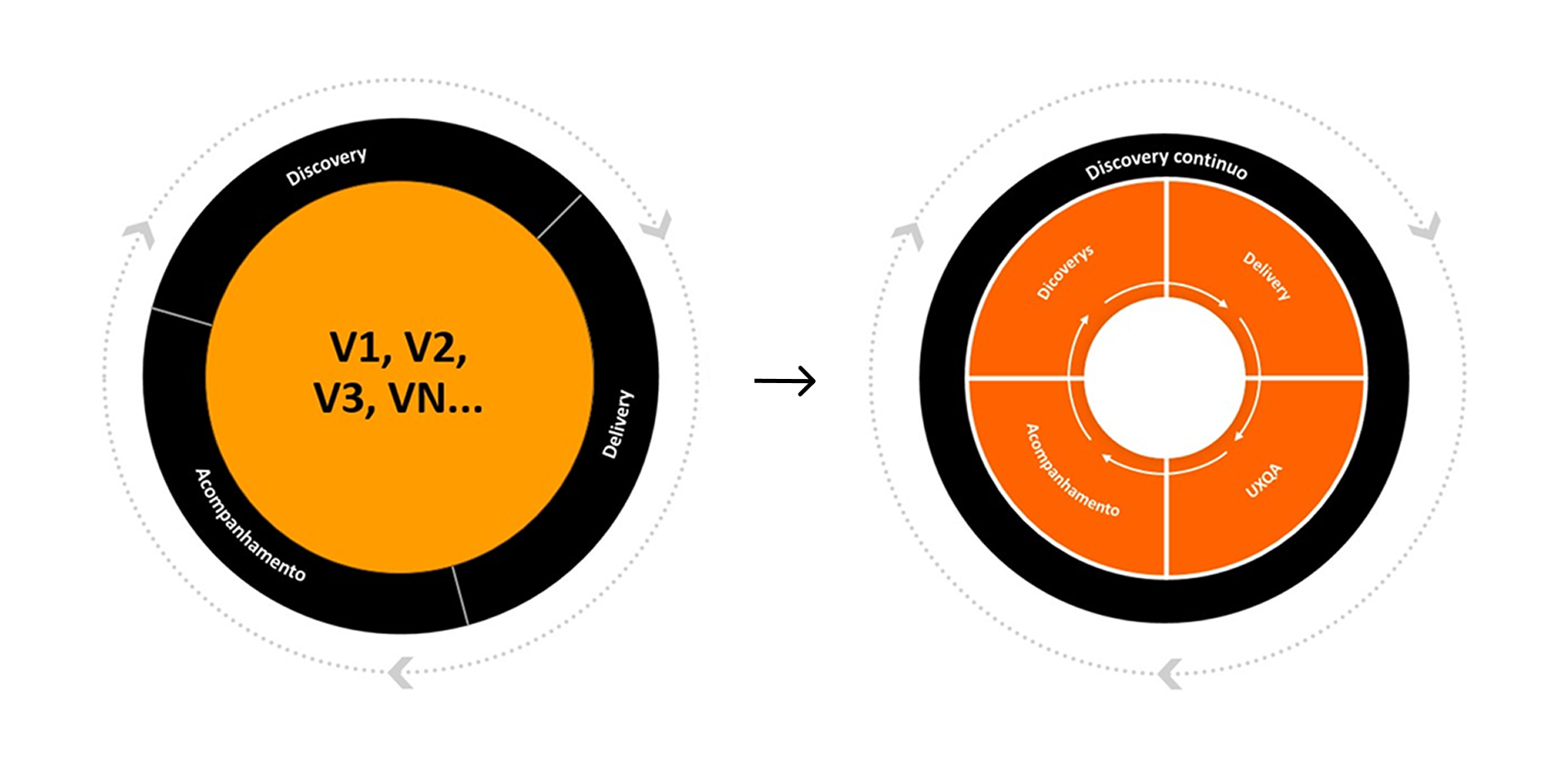
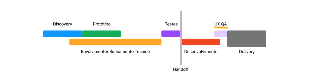
After discussions and analysis of the process stages, it was decided—aligned with the business and development teams—that the UXQA Method would be applied before entering the production environment, ensuring deliveries comply with prototypes and the defined quality criteria.
Process Steps
- After Design Handoff: The process starts as soon as designers hand off prototypes and specifications to the development team. This initial step ensures implementations are evaluated from the beginning, promoting clear alignment between design and technical execution.
- In the Test Environment UXQA is applied at this stage, when screens have already been developed but are still in a controlled environment, with no direct impact on the end user. This moment enables quick and efficient identification and correction of inconsistencies, reducing risks before production.
- Before Entering the Production Environment: The final UXQA stage ensures implemented screens meet established quality standards. Only after approval are deliveries released to the production environment, becoming accessible to the end user with full confidence in the outcome.
Advantages of Implementing at This Point
- Strategic Alignment: Consensus between business and development teams ensured the method was efficiently integrated into the process.
- Early Error Correction: Fixes can be made before issues reach end users, reducing rework and delays.
- Quality Delivery: Ensures the final product faithfully reflects prototypes and meets expectations from all parties involved.
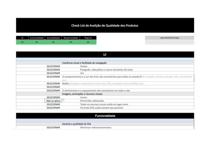
The first version of the spreadsheet was developed to be comprehensive, offering a detailed analysis of UX and UI quality.
Main Features:
- Extensive Criteria: Includes all metrics and heuristics mapped in the initial phase of the method, such as visual consistency, usability, accessibility, and efficiency.
- Automated Calculations: Advanced formulas to calculate the acceptance percentage based on multiple weighted indicators.
- Results Dashboard: Charts and visualizations that facilitate data analysis.
Ideal use
Complex projects with multiple flows and a greater need for detailed analyses.
Processes that require extensive documentation and in-depth reports for stakeholders.
Based on learnings from V1 and the specific Salesforce context, a simplified version of the spreadsheet was developed.
Main Features:
- Focus on Essential Metrics: Reduced the number of criteria to prioritize those most relevant to the Salesforce ecosystem, such as design system adherence and performance.
- Simplified Interface: A more intuitive structure to facilitate use by design and development teams.
- Automated Calculations: Keeps basic calculations, reducing formula complexity and prioritizing agility.
Ideal Use:
- Quick evaluations in Salesforce projects where execution time is critical.
- Processes that require frequent iterations, focusing on efficiency and alignment between teams.
Results and Impact:
- V1 (Full Version) provided a solid foundation for complex projects and was essential to establish detailed benchmarks.
- V2 (Simplified Version) optimized the application of the method in the Salesforce context, ensuring greater agility and practicality without compromising evaluation quality.
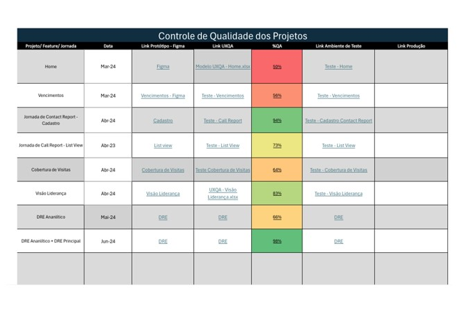
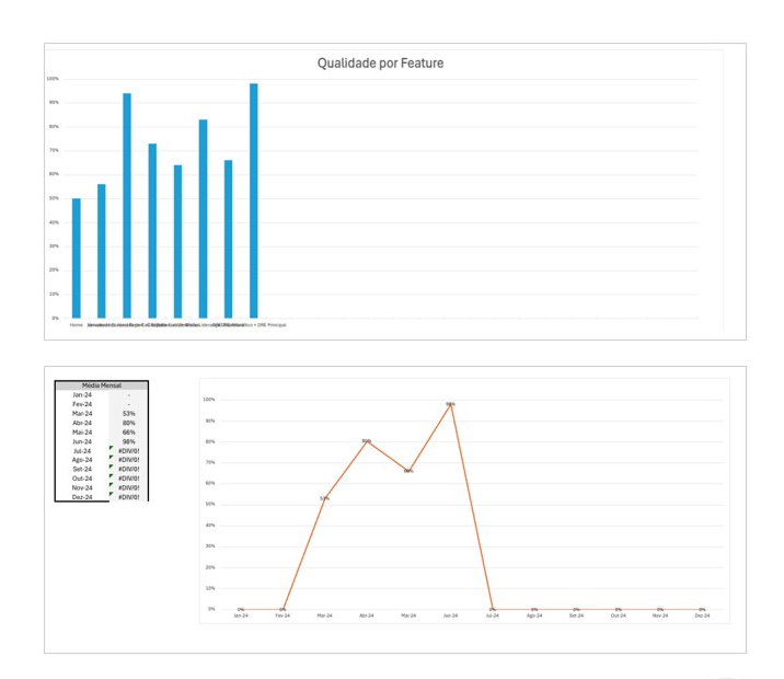
A spreadsheet was developed to compare quality percentages across evaluated screens and generate charts for performance analysis, providing a clear and quantitative view of project progress and overall quality.
Automatic Chart Generation:
- Bar Chart: Side-by-side comparison of acceptance percentages by screen.
- Line Chart: Evolution of percentages over time or by iteration.
Benefits of the Management Spreadsheet:
- Continuous Monitoring: Track screen quality in real time, ensuring objectives are met.
- Pattern Identification: Detect performance trends across screens or criteria, enabling targeted adjustments.
- Visual Communication: Clear, intuitive charts make it easier for stakeholders to understand and promote stronger alignment between teams.
- Support for Iteration: Focus on continuous improvement, highlighting the biggest opportunities for evolution.
The method was implemented in direct collaboration with the development team, ensuring alignment throughout every stage of the process. This integration enabled:
- Significant Quality Improvements: The method contributed to more consistent deliveries aligned with the initial prototypes.
- Expanded Adoption: Designers from other teams started using the method, recognizing its effectiveness in UX and UI quality control.
- Smooth Implementation: The process was structured to be naturally incorporated into the development flow, strengthening collaboration between design and development.
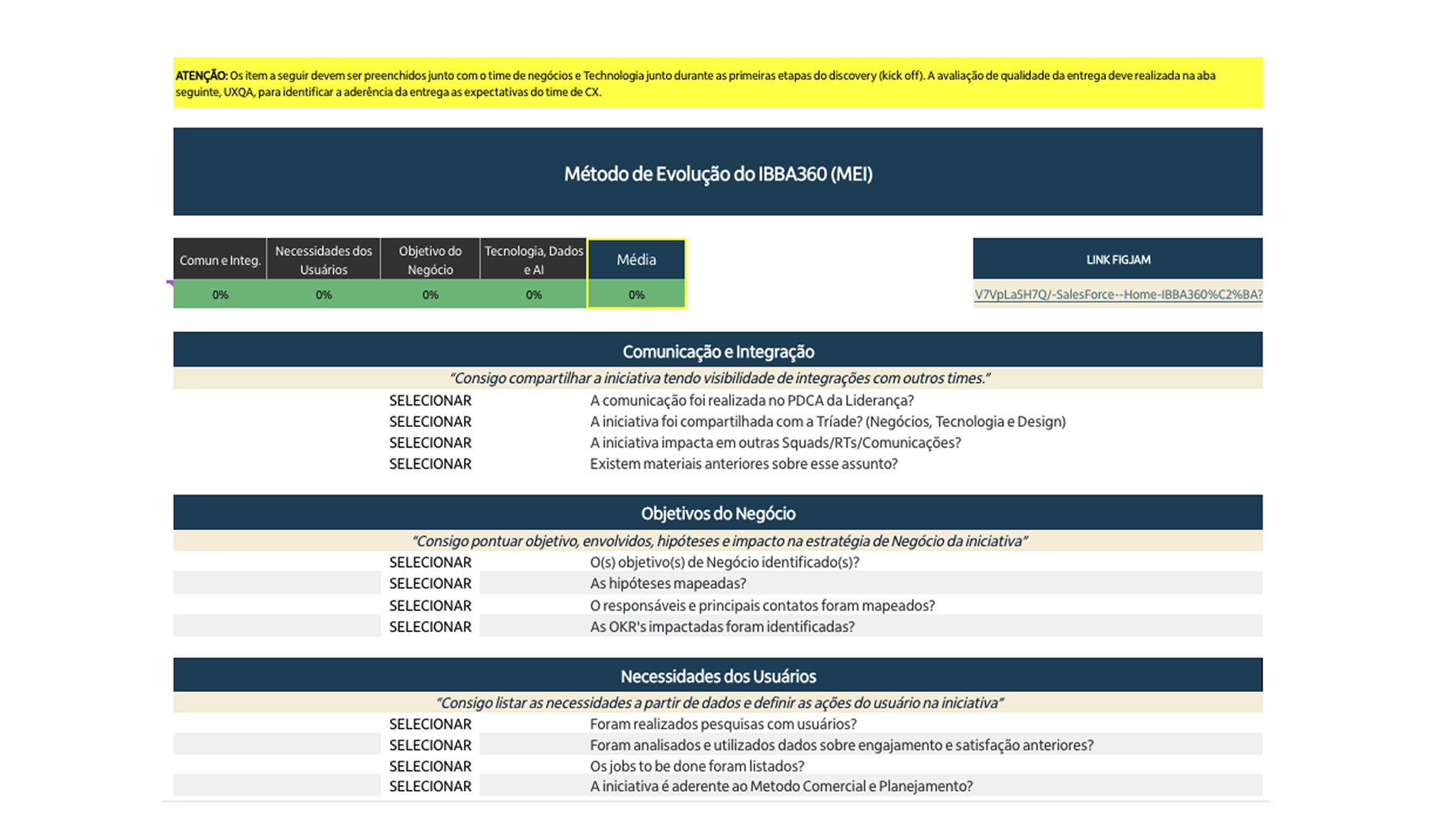
MEI - Integrated Evolution Method is a new tab in the framework that anticipates initial project alignment through measurable criteria. The goal is to start each initiative with an objective diagnosis (baseline) and a clear evolution plan, reducing noise between business, design, and engineering.
Why MEI?
- Early alignment with criteria: organizes expectations and defines the “minimum acceptable standard” before development.
- Quantifying initial criteria: turns perceptions into numbers to make comparison and prioritization easier.
- Evolution cadence: establishes continuous improvement milestones (sprints / releases) with trackable indicators.
Minimum inputs
- Scope and value hypothesis of the problem/feature.
- Baseline criteria (e.g., visual consistency, accessibility, performance, usability, design system adherence).
- Stakeholders responsible for measuring/validating each criterion.
Outputs
- Numeric baseline (initial score per criterion and weighted overall score).
- Evolution matrix (where we want to be by milestone and by sprint).
- Initial acceptance checklist to start development.
How to use in practice
- 1) Define weights by criticality (e.g., Accessibility 25%, Consistency 25%, Usability 30%, Performance 20%).
- 2) Score the current state (0–100) per criterion and generate the baseline weighted score.
- 3) Set milestone targets (e.g., Sprint 1 → 70, Sprint 2 → 82, Go-Live → 90).
- 4) Record owners and evidence (screenshot, Figma link, PR, etc.).
Expected benefits
- More predictability and transparency about quality from day zero.
- Less rework due to misaligned expectations.
- A comparable history of evolution throughout the project.